
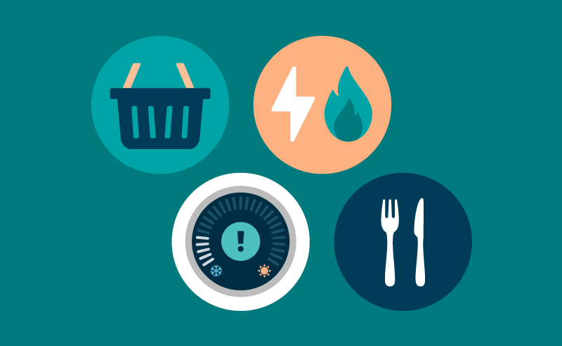
Cost of living insights: Food
The latest data and trends about the cost of living. Explore changes in the cost of food and how this is affecting people.
DataDeception
This website is a recreation of UK Government’s website for Office on National Statistics on the Cost of living latest insights on Food.
All data presented is real, and presented in a matter to hide the on-going cost-of-living crisis to explore how can a government use data visualisation as a tool for authority to push self-beneficial agendas.
Misleading data sits the centre of authority’s power on public belief, it plays vital roles in everyone’s lives - guiding the decisions of policymakers and dictating mainstream news reporting.
As well as that, it affects a government’s political gain, public support, and economic stability, influencing the allocation of resources/funding, and avoiding accountability.
It’s ironic because when you look at the government website, they already do this - highlighting key points on how the situation is improving and hiding the rest.
This project aims to underscore the importance of transparency, accountability, and ethical data presentation.
Source: Office for National Statistics
Source: Department for Environment,
Food & Rural Affairs
Source: Office for National Statistics
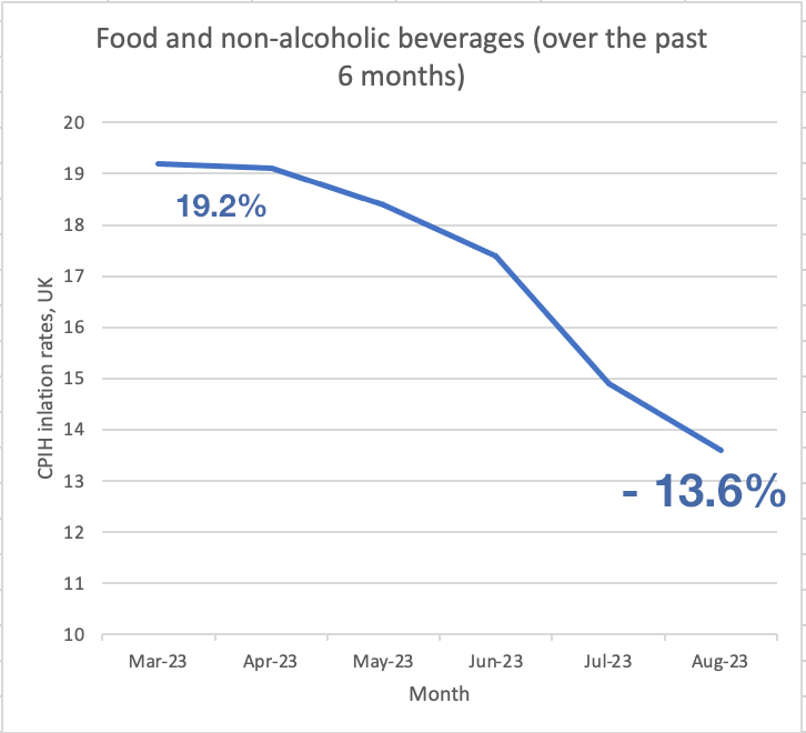
so it looks like the price is going down, However
even if the [% goes down], the price is still actually
still increasing because there’s still a net percentage
increase
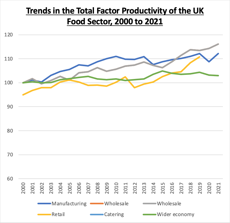
[% Efficiency] has nothing to
do with the price consumers
pay for their food. Or the wages
workers receive from producing
food. It only looks good for the
government and is on how
producers are making food.
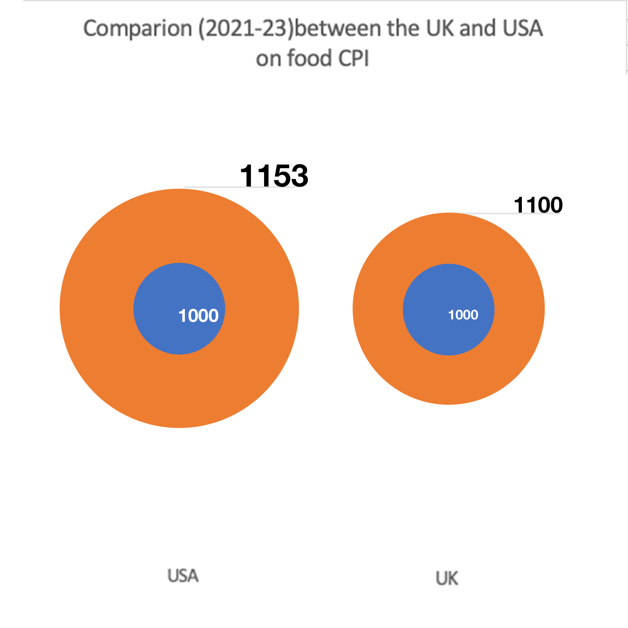
a common trick used in data
visualisation to make a difference
between 2 data points more
extreme than it is.
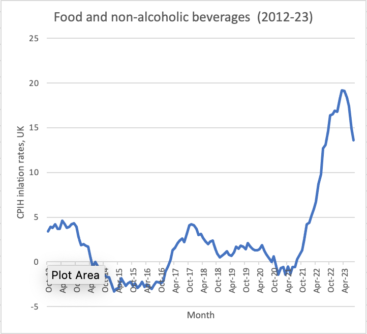
The first graph only includes
data from March 2023, If you
were to look back from 2012, it
paints a very different picture:
The rate of food inflation has
been rising at unseen levels
since 2021
Download the data
Food inflation continues to ease with dairy prices falling
Prices of food and non-alcoholic beverages is down to 13.6% in August from the recent high of 19.2% in March 2023, which was the highest annual rate seen for over 45 years. according to the latest Consumer Prices Index including owner occupiers’ housing costs (CPIH).
The largest downward contributions came from milk, cheese and eggs, as well as mineral waters, soft drinks and juices.
This is according to our Consumer Prices Index including owner occupiers’ housing costs (CPIH) release.
Prices for cheese and curd fell 3.3% between August and September, the largest downward contribution in the milk, cheese and eggs category.
This has led to the annual inflation rate for milk, cheese and eggs easing to 12.3% in the year to September 2023, down from 15.3% in August.
However, this figure was much higher among certain groups of the population. Read our bulletin on the impact of increased cost of living to find out which groups were most at risk of running out of food.
You can explore how the prices of 450 items in the inflation basket – including the cost of food and eating out - have increased over the past year with our shopping prices comparison tool.
Productivity & Efficiency Trends
Total factor productivity of the UK food chain beyond the farmgate rose by 3.7% between 2020 and 2021, while productivity in the wider economy fell by 0.2%.
Total factor productivity relates the volume of output to the volume of labour, capital and purchases, and so can provide a measure of efficiency.
The TFP of the UK food sector is an indicator of the efficiency and competitiveness of the food industry within the UK. However, there are external factors at play, in particular the onset of the COVID-19 Pandemic.
In 2021 all four of the food sectors had a higher productivity than in 2020. Manufacturing increased by 3.2 per cent, wholesale increased by 1.5 per cent, retail increased by 2.3 per cent and catering increased by 10.7 per cent, the latter demonstrating nearly a full recovery from the conditions faced during the height of the pandemic.
The calculation is based on reliable data on business sales and costs, employment by industry and price indices all collected by the Office for National Statistics.
Source: Total Factor Productivity of the United Kingdom Food Chain, Defra.
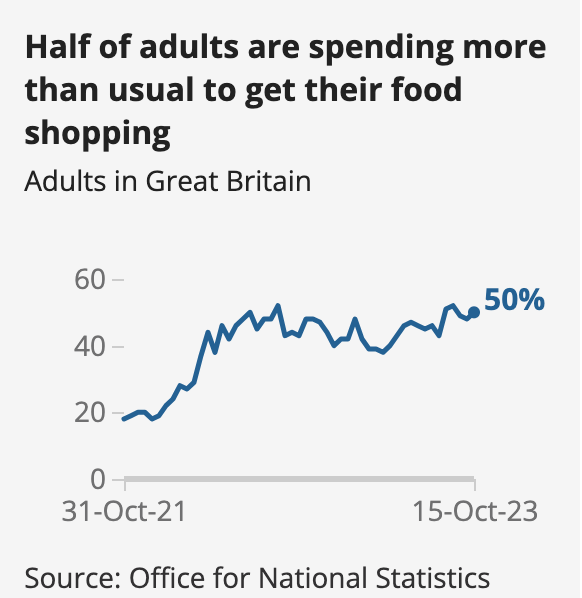
Spending
Nearly half (48%) of adults across Great Britain say they have spent more than usual to get what they normally buy when food shopping within the past two weeks.
This is according to those asked between 20 September and 1 October 2023 as part of our latest Public opinions and social trends bulletin.
Source: Office for National Statistics
Source: Office for National Statistics
Source: CEBR & Office for National Statistics
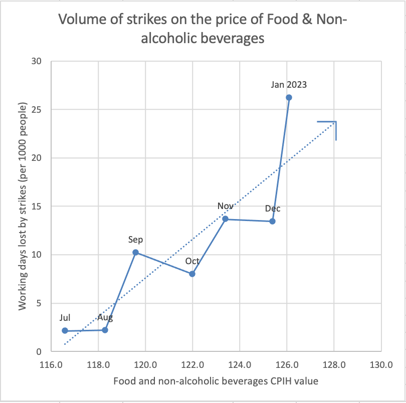
between the price of food to workers
striking, presenting it alongside the
other graphs makes it look at first
glance that workers striking is part
of the reason for inflation
 This data can go on to be used as evidence as to why laws and legislations should be passed.
Download the data
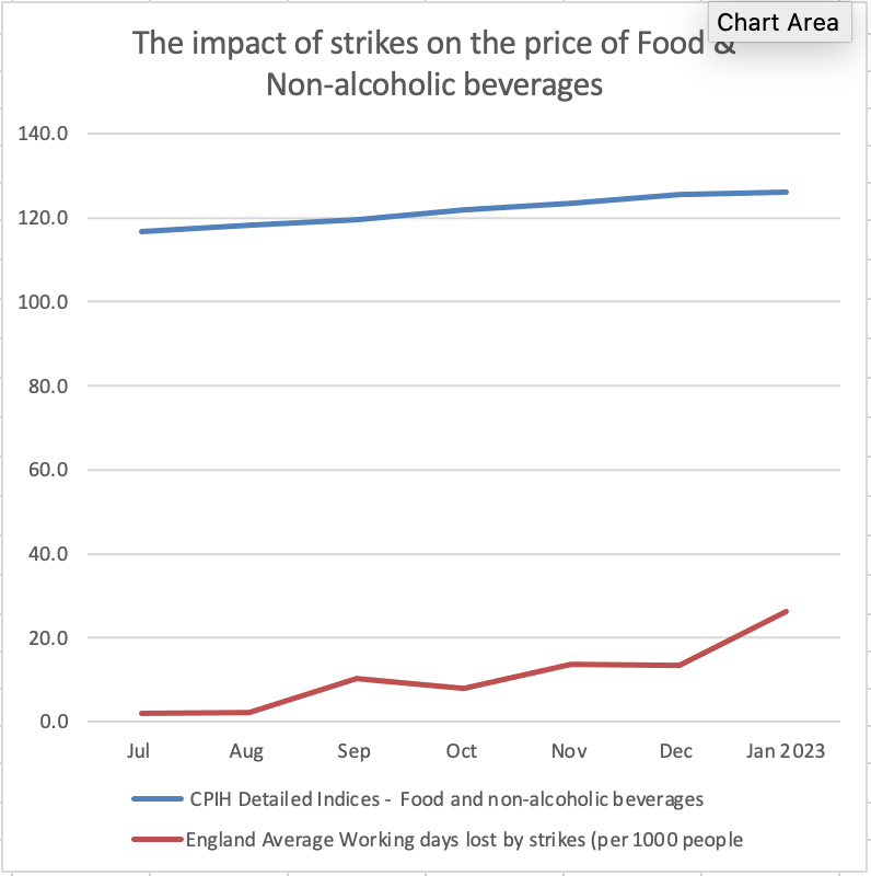
The Impact of workers striking on the price of food
Between June 2022 and February 2023 there have been increasing numbers of strikes occurring across a range of industries, including many parts of the rail and bus networks, postal workers, civil servants, teaching staff and NHS staff. This article brings together a range of sources to explore the impact of the strikes that have taken place since the summer of 2022.
The average working days lost by workers striking have reached an all-time high of 26.23 days (per 1000 people), from 2.125 July 2020 where it was 2.22.
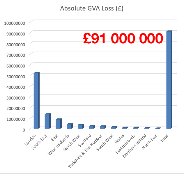
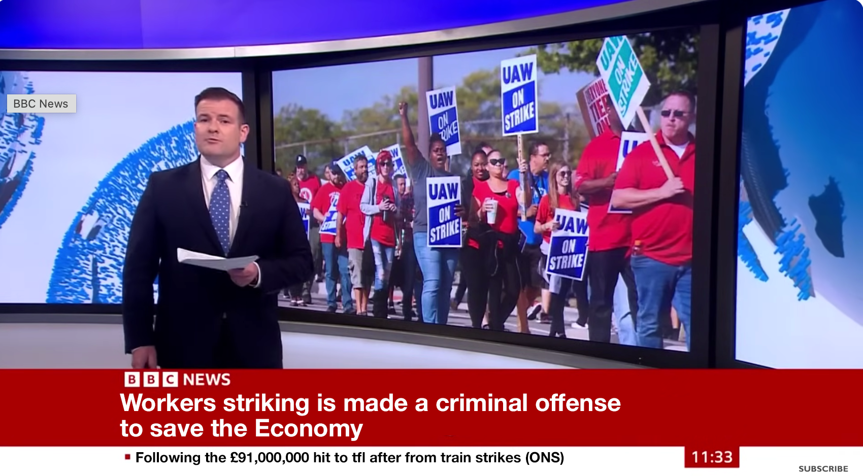
Rail and tube strikes to cause hit of at least £91m to the UK economy Rail and tube strikes to cause hit of at least £91m to the UK economy
As the hit of strikes increased, the price of food has risen to unseen levels.
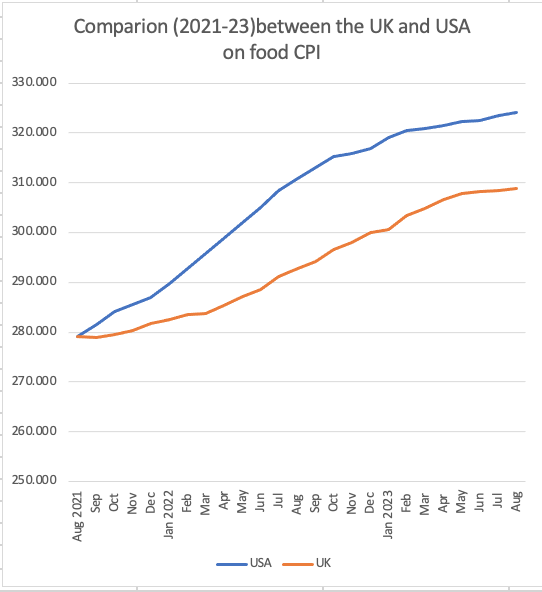
Source: Office for National Statistics
& FRED Economic Data
Source: Office for National Statistics
& FRED Economic Data
a common trick used in data
visualisation to make a difference
between 2 data points more
extreme than it is.
Download the data
Comparison in Food prices (CPI)between the UK and USA
To find the true state of the UK, it is important to compare it to other successful countries. Here we have compared the rise in food prices in the UK to the US (Consumer Price Index).
It shows that the UK is doing better off than the US with prices inflating at a slower rate than the US
How this affects you
Related links
Read our summary of our current and future analytical work related to the cost of living.
The government is offering help for households. See what cost of living support you could be eligible for.
Explore the UK Measures of National Well-being dashboard, which tracks the progress of a range of factors affecting people’s lives. We have explained some of the findings from new measures added in 2023 in our Most adults report making some changes to their lifestyle for environmental reasons article.